
Could there be any controversy? Gift set packaging is the vintage Barbie art category most likely to make a good calendar.
Consider:
- Many lush, color images
- Already an appropriate scale (12″ or so tall; many are roughly square)
- It would be fun to map gift set illustrations to seasons and holidays
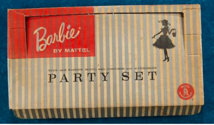
The earliest sets had “discreet” packaging, for sure; apart from a single silhouette they weren’t really even illustrated. Still, the early “Party Set” box above is our pick to kick things off in January.
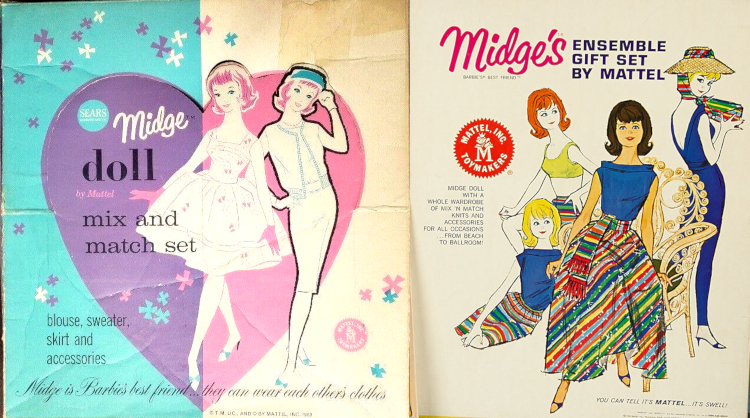
Next up is a Midge double-header. For February, the Midge Mix and Match Set demonstrates what we call the “sketch-collage” style; another example is the Tennis Set at the top of the post. The illustrations have a technique and sophistication similar to the early carrying cases, supplemented by some simple decorative flourishes.
Following on the heels of the “sketch-collage” style in the package design timeline is the “superior fashion booklet” style, as we see on Midge’s Ensemble Gift Set, above right. These illustrations are close relatives of the contemporaneous fashion booklet ones, but with a little more scenery and more complex layouts; the Little Theatre Gift Set provides another example.
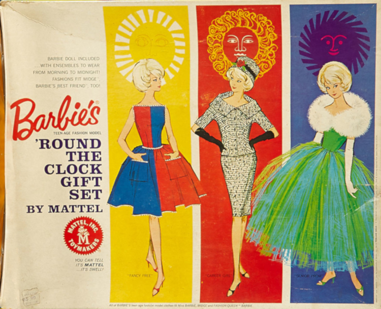
April brings our personal favorite instance of “superior fashion booklet” style on a vintage Barbie gift set, this brightly-hued ‘Round the Clock set:
We’ve heard time and time again that canonically, Barbie and Ken never married. However, Mattel’s products didn’t match that messaging in the early ’60s, when they repeatedly released trousseau sets and eventually this 1964 Wedding Party set for the lovebirds:
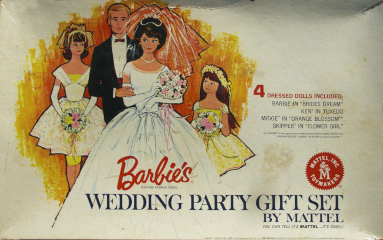
Trousseaux and wedding gowns were common among the creepy, baby-proportioned fashion dolls that preceded Barbie, which may explain this trend–Barbie’s very first trousseau may even predate Ken. Anyway, this packaging, our pick for a May non-wedding, is still in the “superior fashion booklet” style, but also alludes to a loose, marker-y style similar to the Sew-Free Fashion Fun Kits; that look, which we’re calling “courtroom portrait” today, is fully embodied in one of the trousseau sets.
Through 1965, the gift sets consisted of garments and accessories also available in other sets, either paks or ensembles, perhaps with a few add-ons (some dishware in the Hostess Set; a tiny ring on a pillow in Wedding Party). In the second half of the decade that all changed, along with the advent of a package illustration style we simply call “sumptuous.”
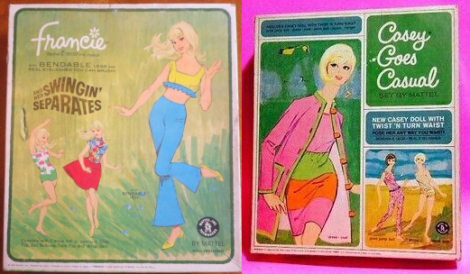
The grassy imagery in Francie’s 1966 Swingin’ Separates set is perfect for June, and 1967’s Casey Goes Casual, with its scene of Francie’s jelly-torsoed friend dancing at the beach, is a worthy follow-up for July. These are early-sumptuous illustrations, filling the space with scenery and detail but not quite as ambitious as the high-sumptuous illustrations still to come:
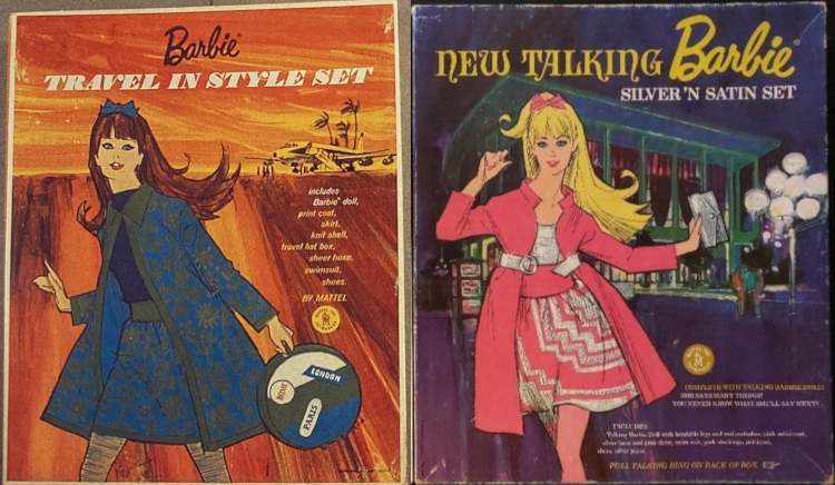
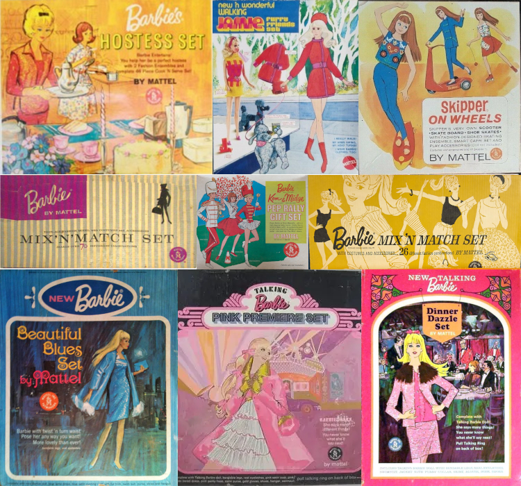
We had to opt for the 1968 Travel in Style set, with its sweltering airport runway, for August, while September goes to the Talking Barbie Silver ‘n Satin Set of the same year. We’ve entered the Hellenistic era of the “sumptuous” style, and Silver ‘n Satin is its Winged Victory of Samothrace: The movement! The drama! (What is she running from?) So many stunning gift sets were released over a period of about two years, we can’t showcase them all; other notable works include Beautiful Blues, Pink Premiere and Dinner Dazzle.
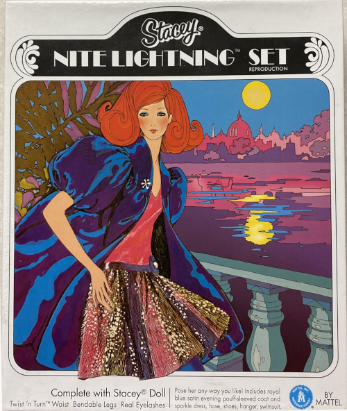
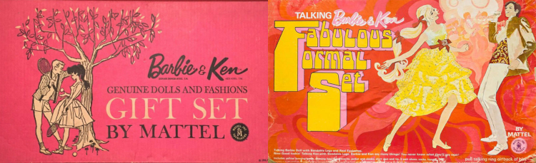
For October’s featured image we have the 1969 Stacey Nite Lightning Set. This illustration is still vivid, and yet more stylized, a nod to the late 1960s Art Nouveau revival. The Fabulous Formal set shown at the top of the post, from the same year, also fits this scheme.
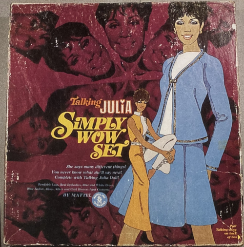
November is another ’69 pick–Talking Julia’s Simply Wow Set–at which point we see the “sumptuous” period is subsiding. The Julia fashions are nicely illustrated, but they are not placed within a scene; instead, a kaleidoscope of photo images of the head of actress Diahann Carroll, who played Julia, fill the remaining space.
The high period of gift set art declined and fell: starting in the 70s, packaging consisted of photographs of the sets’ contents, useful to the shopper but not particularly expressive.
Before the inevitable end, in 1970 a series of charming graphics combining product photos and illustrations graced the exteriors of sets for Barbie, Jamie, Skipper, P.J. and Ken. Each illustration featured the character in question, in some detailed setting, gazing into a shop window within which the photographic element accurately depicted the sets’ contents. The compositions are all clever and appealing, and although Living Barbie’s Action Accents, with its ski chalet scenery, is more than worthy of a winter holiday, our ultimate choice for December had to be the festive P.J. Swingin’ in Silver set:
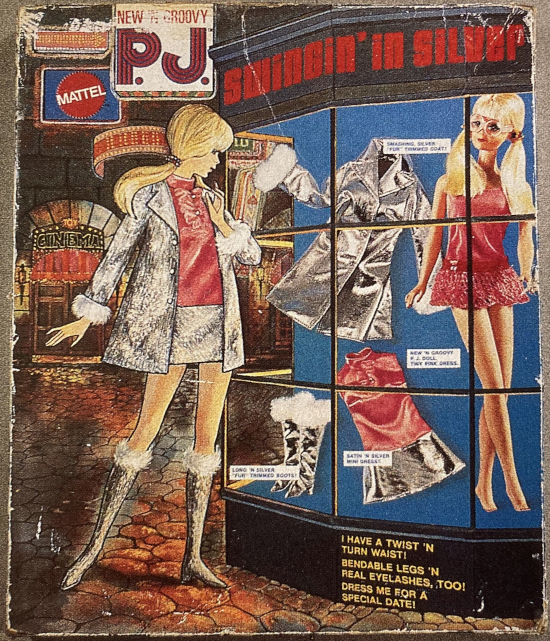
1970 P.J. Swingin’ in Silver gift set. Source: Barbie Doll Fashion, Vol. II by Sarah Sink Eames.
Because a period of high artistic output was in its dying throes, we call the series of graphics from 1969-70 combining drawings and photos the “decadent” style.
Now you’ve seen all the significant epochs in Barbie gift set illustration styles from 1960-1970: discreet, sketch-collage, superior fashion booklet, courtroom portrait, early-sumptuous, high-sumptuous or Hellenistic-sumptuous, and decadent. Which one is your favorite? What swaps and substitutions would you make, to craft the ultimate 12-month calendar? There were so many lovely gift set illustrations we didn’t have space for, including a couple Skipper sets–maybe next time we’ll aim for 18 months!
Where to next? This post is about vintage Barbieillustrations. Our most popular post in the category is on Mattel fashion booklets. The most recent post in the category is on the World of Fashion board game. Other popular posts on this site include the Many Abodes of Barbie series (currently covering 1962-1970) and our Chronicle of Barbie shoes, 1959-67. Or just head up to the Table of Contents to see more options.

Leave a comment